
Movify
A website designed to help users easily tackle the daunting task of a move via personalized timelines, checklists, and community suggestions.
Role
Sole Designer — Research, UI/UX design, Prototyping, User Testing, Branding
Timeline
4 months
Tools
Figma, Optimal Workshop, Miro


On average, Americans can expect to move 11.7 times in their lifetime…
According to the US Census Bureau, Americans can expect to move an average of 11.7 times in their lifetime
So why do users report it being a stressful endeavor every time?
In a study conducted by OnePoll, 45% of participants reported moving as the most stressful life event.
What seems to be the problem?
People delay planning their move because it feels overwhelming, adding to their responsibilities and causing significant stress as the move approaches.
It seems that people know that better planning ought to offset the stressors of moving, but lacking motivation and not knowing where to start pose significant barriers to effective planning.
What is missing from the marketplace?
I conducted a competitive analysis of exisiting marketplace solutions…
1. Centralized platform
Existing solutions give users the power to perform specific tasks but still require users to do research elsewhere before they can start their task
2. Personalized solutions
MoveAdvisor provides users with a timeline and resources but they’re not tailored to their users’ specific needs
3. Accessible tools for all movers
Updater provides the most comprehensive tools but access is limited to movers associated with partnering brokerages


“Planning ahead for my cross-country move made all the difference. Being more organized really reduced the stress and helped everything go smoother.”
Linda, Interviewee

“It’s incredible to see how your friends rally around you during a move. Those little moments of help and support make you realize the strength of your community.”
Rachel, Interviewee

User Interviews
5 interviews conducted
I wanted to gather insights on…
the specific barriers preventing users from planning
what would incentive users to be proactive
“The best part of moving was doing it with friends. Even though it was exhausting, the satisfaction of getting everything done together made it all worth it.”
Allan, Interviewee

Interview Insights
Through Affinity Mapping, I noticed two patterns that clarified what would simplify the planning associated with a move and make a move more enjoyable.
Friends and family make moves faster, easier, and more enjoyable.
Users want personalized checklists and timelines alongside standard tasks.
Empathizing with Personas
Using discoveries from my primary and secondary research, I created proto-personas to forefront user needs in the design process.

Maria Silva
The Overwhelmed Connector
"I know my friends and family would help, but I hate the idea of bothering them with my stress. I just wish I could make this whole thing less overwhelming."
-
Maria is moving to a new home to be closer to her family. She is feeling overwhelmed by the emotional and physical demands of the move and knows she could use help from her friends and family but doesn’t want to burden them. Maria values her social connections and understands that leaning on her network could make the move less stressful and more meaningful, but she’s unsure how to ask for support.
-
Stay connected with her social network for emotional and physical support during the move.
Offload some of the stress associated with moving by involving her friends and family.
Create positive memories and experiences during the moving process.
-
Feeling overwhelmed by the moving process and unsure how to ask for help.
Balancing the emotional stress of moving with the physical demands.
Wanting to make the moving process a positive experience despite the challenges.

David Chen
The Busy Balancer
"I know I need to get started on this move, but every time I think about it, I just end up putting it off for something more fun."
-
David is a young professional with a demanding job that often spills over into his personal time. He’s about to move to a new city for a career opportunity but struggles to find time for the tedious tasks involved in the moving process. David tends to procrastinate and feels guilty when he can’t make time for activities he enjoys due to the overwhelming moving to-do list.
-
Efficiently manage moving tasks without letting them interfere with his work or personal life.
Avoid procrastination and tackle moving tasks in a timely manner.
Ensure he can still enjoy his hobbies and social life during the moving process.
-
Balancing a busy work schedule with the demands of moving.
Procrastination due to the tedious nature of moving tasks.
Feeling overwhelmed by the number of tasks and the time they require.

How might we make it easier for busy young professionals to avoid procrastination and confront tedious moving tasks?
Idea Generation
Using creative thinking strategies, I allowed myself to think outside of the box. No matter how outlandish, I believe there’s always inspiration to be found that will come in handy later!
I selected an idea based on user needs, project goals, and resource availability. The selected idea met all the following criteria: it simplified the moving process while making it enjoyable, catered the the unique needs of all users, and was tangible given constraints.

Who is it for?
Idea Selection
AI Generated Tasks + Personalized Plan
What does it do?
It leverages AI to create a personalized list of common and city-specific moving tasks, allowing customization and gamifying the process to make even the less enjoyable tasks more engaging.
How does it work?
The app uses ChatGPT-4 to generate a customizable list of moving tasks, suggests a timeline integrated with the user's calendar, and rewards completed tasks with unlocked content, such as a storyline or redeemable points for digital art.
Users seeking structure in planning and executing their move, providing a clear starting point to identify tasks and schedule time to complete them
Priority 1: Must Have
Priority 2: Nice to Have
Priority 3: Surprising & Delightful
Priority 4: Can Come Later
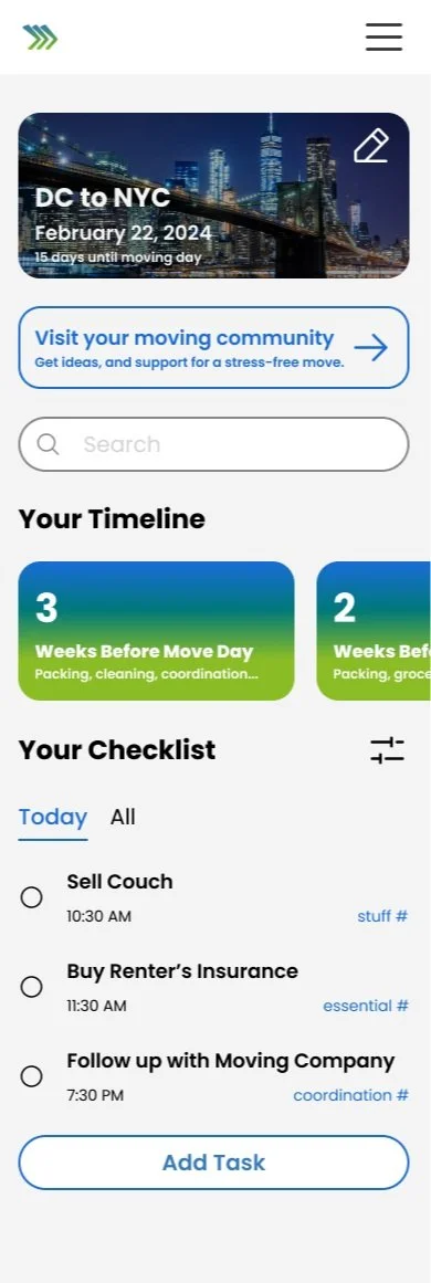
Login/Signup Page
First screen for account creations with options for Apple, Google, or traditional signup
Onboarding Walkthrough
Collects user information, preferences, and details about the upcoming move
Profile Page
Displays the user’s past moves, created content, and unlocked achievements
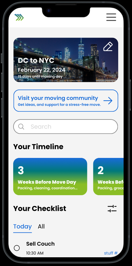
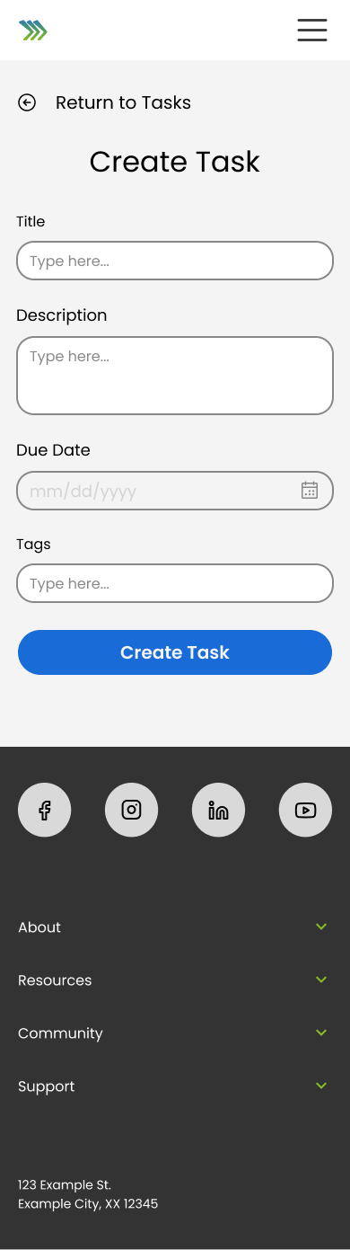
Customizable Plan & Timeline
Allows users to personalize their moving plan by adding unique tasks and deadlines
AI-Generated Moving Tasks & Timeline
Automatically creates a moving plan based on the users’ intake form, which can be reviewed and customized
Reminders
Sends notifications via SMS or email for upcoming deadliens
Calendar Sync
Integrates with users’ calendars to show free time and allow for the scheduling of moving tasks
Resource Finder
Helps users easily locate services and resources for completing moving tasks
Moving Content
Provides blog posts and curated articles about moving, with actionable tips and reccommendations
Task Feedback Mechanism
Provides platform for users to comment on tasks, share difficulties and offer tips
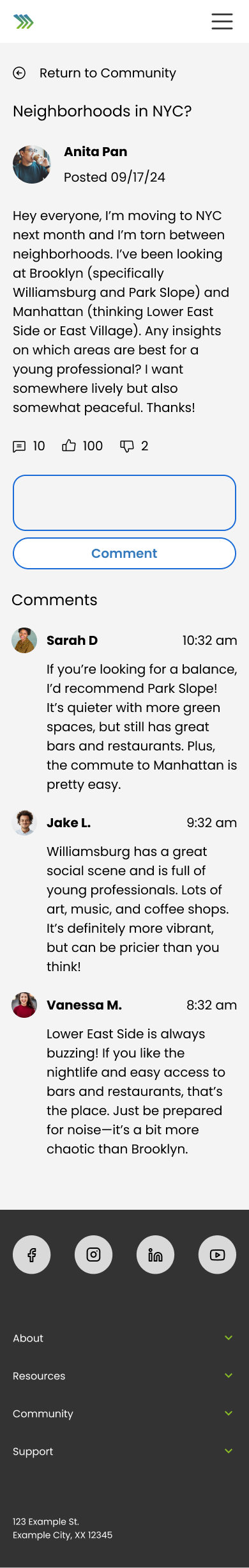
Social Timeline
Enables users to view and interact with others’ moving journeys, and add tasks from their plans to their own
Daily/Weekly Check-In
Offers a daily summary with the option to add text and photos, reflecting on progress and providing motivation
Sharing Progress
Allows users to share their moving progress on external social media platforms.
Picture/Journal Log
Allows users to document milestones of the moving process with photos and journal entries
AI-Generated Slideshow
Generates a slideshow using pictures and journal entries to celebrate and document the moving process
Gamification
Rewards users for daily check-ins, task completions, and interacting with others’ plans by unlocking special content
Feature Prioritization
I listed all the features that would make the website valuable and enjoyable to use. I ranked the features based on feasibility, user needs and their proximity to the product’s main purpose. I also factored in what would be essential for an MVP.

Idea Pivot
Based on how I prioritized features for the MVP, I ended up positioning the gamification feature as low priority given the complexity of the feature. There are other ways to keep users motivated about moving without the added complexity of the gamification piece so I decided to omit it from the MVP.
Mapping out the Experience
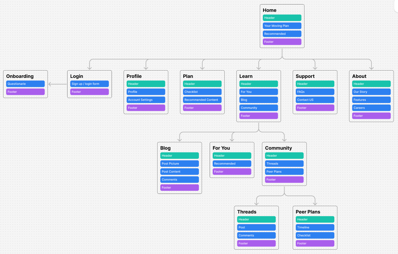
Site Mapping
Using insights I gathered from card sorting, I created a visual representation of all the pages that would exist in the site.

User Flows
Taking into account my persona’s needs, behaviors, and context, I outlined how users would navigate the site to achieve their goals.

Task Flows
I detailed the steps that users would take for the completion of specific tasks. This allowed me to optimize particular flows and to set the stage for my low-fidelity wireframes.
Low & Mid-fidelity Wireframes
I initially took pen to paper and drafted the layout of key screens before I digitized those drafts. There were a ton of screens I could’ve added by the feature prioritization matrix plus the user and task flows kept me focused.
Initially, my low-fidelity screens focused on a desktop experience but considering context and personas, a mobile experience makes the most sense
For my mid-fidelity wireframes, I focused on identifying what content needed to be present on which screens for specific features.


Branding & UI
I built a style guide that reflects the following values: confidence, collaboration, freedom, organization, and simplicity
Inspired by the simplicity of websites like Notion and Akiflow, I wanted a clean and clutter feel to the website but I wanted color to make the website feel exciting.
High-fidelity Wireframes
I applied the core brand values reflected in the style guide to polish my wireframes and achieve a pixel-perfect design. Placeholder content was also added to reflect what the user could expect to see.
Before applying the styles, I created more components based on elements I expected to reuse like the content cards and comments in the community section.
These screens are intended to closely resemble the final product and were made ready for prototype usability testing.


Goals
Assess how effectively key tasks are completed
Evaluate its appeal versus traditional moving tools
Usability Testing Plan
Task Flows to Evaluate
Creating an account
Completing onboarding
Viewing and managing personalized plan
Searching for help in community section
Incorporating community suggestions in plan
Browsing for resources
Task Flows to Evaluate
Task completion: Users complete tasks with minimal or no errors
Time on task: Measure the time taken for each task
Pause duration: Track the pause time between each action
Task ease: Users rate task ease on a scale of 1-10
Task usefulness: Users rate task usefulness on a scale of 1-10
Task enjoyment: Users rate task enjoyment on a scale of 1-10
#1
Onboarding Needs Simplification
4/5 users reported being confused by what the preference section was asking of them
#2
Timeline View Missing
4/5 users reported that they expected the dashboard view of their tasks to be similar to the preview they saw when they completed onboarding
#3
Community Feature Needs Visibility
5/5 users reported being surprised when asked to navigate the community section because they didn’t know such a feature existed on the website
#4
Tasks were easy to complete
6/6 tasks were complete by all users with little to no error
#5
Users felt equipped to tackle moving
5/5 users reported that navigating the app made them start thinking about their next move in a more systematic manner
#6
Clear permissible actions on screens
5/5 users reported that the design was free of visual clutter and took no more than 10 seconds to complete each task
Results & Revelations
Revisions


4/5 users reported being skeptical regarding why they were being asked for their monthly rent. Since the current plan generation doesn’t use the monthly rent in any way, that input was removed to decrease risk of users skipping this step.
4/5 users reported being confused when they landed on this page since the plan (timeline view) that they saw on the preview was different. They liked the task view but wanted to see how far along they were progress wise in their move so I added a timeline section which reflects what they would expect to see based on their preview.
User reported not really understanding the "Plans by Peers" section. They mentioned if they could see more details about the Plans by Peers, they could be more compelled to copy to dashboard.


5/5 users reported being confused with what the form was asking of them when posed with an open input. Free response was replaced with dropdown values to decrease mental load and decrease risk of skipping.
Detailed timeline view added so users can see which tasks they should’ve completed at the point of the moving process that they’re up to.


Clearer language and View in Dashboard button more prominent to indicate that they user can further interact with their personalized timeline and tasks on a different screen.
Confirmation for move details added to make plan feel more personalized. Users were previously underwhelmed with preview and felt that the plan looked too generic since the details they inputted were not reflected in the preview.
Search bar experience updated since 3/5 users reported going first to search bar to browse before clicking around.
Prototype
Takeaways…
#1
Fight the urge to add more features in the iteration phase!
I got so much good feedback on how I can improve the product and got really excited about incorporating it but in my next project I want to keep it focused on the specific feature that I’m testing
This will allow me to deliver something flawless as opposed to a bunch of features that are not fully complete (I ended up having more features than I intended because they seemed related in the moment but they’re actually different)
#2
A diverse pool interview pool is crucial
I ended up interviewing young professionals between the age of 20-30 which narrowed the contexts in which the product may be used
This created a lot of similarities between all the interviews but the significance of those similarities may be skewed since they only reflect a portion of the population
Looking Ahead…
Reflecting on this project, I learned about designing a mobile app for young professionals struggling with balancing the responsibilities associated with moving alongside their existing demanding schedules. I created a centralized hub for planning and research, eliminating the need to sift through various platforms, effectively decreasing the mental load for planning during the moving process.
Moving forward, I plan to interview a more diverse pool of movers (including families, people immigrating to another country for the first time, etc) and to introduce user engagement incentives. To make this website the perfect solution for every move, I need to understand how a tool like Movify can serve different populations. Additionally, after users are done with their move, how can I get users to come back to Movify? I’d love to explore these options in the future!